Using Apple computers, the programs I use for typesetting are versions of Indesign and QuarkXpress, as well as Word, Photoshop, Illustrator and Acrobat. I have a comprehensive collection of fonts from libraries such as Adobe, Linotype, Bitstream, Font Factory, Parachute, Font Bureau, ITC, Canada Type, Linotype, Subtipos, Monotype, House Industries and Elsner & Flake with many of them in Opentype format so they can be used cross-platform. I carry many of the newer popular book faces being used today, like Amster, a winner of the 2013 Type Directors Club Type Design Competition and chosen by Typographica in 2012, as well as previous winners like Neacademia, Guillaume, FF Reminga, Garvis, Calluna, Scala and Pesaro, and all the traditional fonts: Garamond, Bodoni, Sabon, Plantin, Trump, Bembo and Baskerville.
Go to this section to see some font examples.
For scanning transparencies and prints I have an Epson Perfection V700, using SilverFast. For colour proofing I have an HP Photosmart Pro B8190 and HP Photosmart 8750. A QMS 9100 laser printer is used for mono proofing up to A3 paper size. I also have an HP Colour Laser, A4 size only.
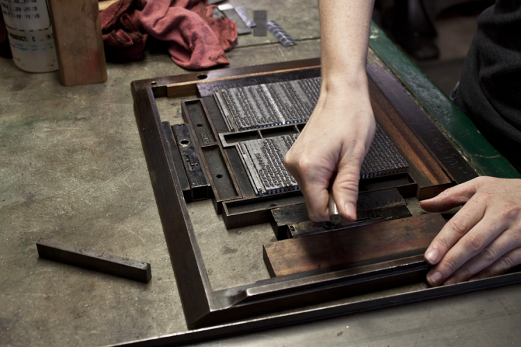
Below, letterpress printing, popular right up until the 1980s. Called a chase, once typeset, the lines of type were held in by furniture and tightened by quoins, then transported to the printing press. They could be very heavy.
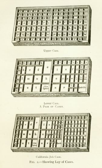
Up until the late 1970s most jobbing printers composed their work by picking out individual characters from a ‘case’. I did a 5-year apprenticeship learning this to become a skilled compositor. As soon as I had finished my apprenticeship technology arrived in the form of phototypesetting and then litho printing was king, letterpress printing was slowly dying. Words like upper- and lower-case are still used today. Leading refers to the distance between the baselines of successive lines of type. The term originated in the days of hand-typesetting, when thin strips of lead were inserted into the forms to increase the vertical distance between lines of type. Now mainly referred to as line spacing. Those individual letters that were picked out were reversed and so the skill of reading backwards and upside down was soon mastered.