WRONG. The text does not wrap around the Drop Cap, the 'S' is separated from the letter 'A'

RIGHT. The text wraps nicely around the angles of the Drop Cap and now reads as 'AS'
WRONG. Called an orphan, bottom line, a new paragraph appears on its own, separated from the rest of the text
RIGHT. The opening line of a paragraph no longer sits on its own, adjust the font tracking to change paragraphs
WRONG. Last line of a paragraph appears at the top of a page – a widow – adjust font tracking on previous page
RIGHT. By taking back the last line to the previous paragraph, it now looks again pleasing
WRONG. The Drop cap, ragged right text, double spaced paragraphs and an orphan
RIGHT. Indented paragraphs, justified and with text wrapping around the Drop Cap
WRONG. Leading between lines too little, too squashed
RIGHT. So much easier now to read with the right leading applied
WRONG. Automatic hyphenation looks ugly, always turn it off
RIGHT. If hyphens are really needed, then apply them yourself


Bodoni
Garamond
Perpetua

Gill

Caslon
Optima
Agmena
Baskerville

Sabon
Palatino
Amasis
Minion

Neacademia
Modern
Hoefler
Warnock
Galliard
Albertus
Maiola

Scala
Garibaldi
Garvis
Walbaum

Amster

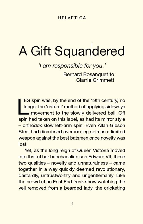
Helvetica
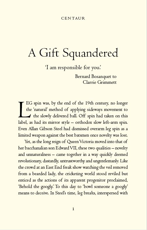
Centaur
Times

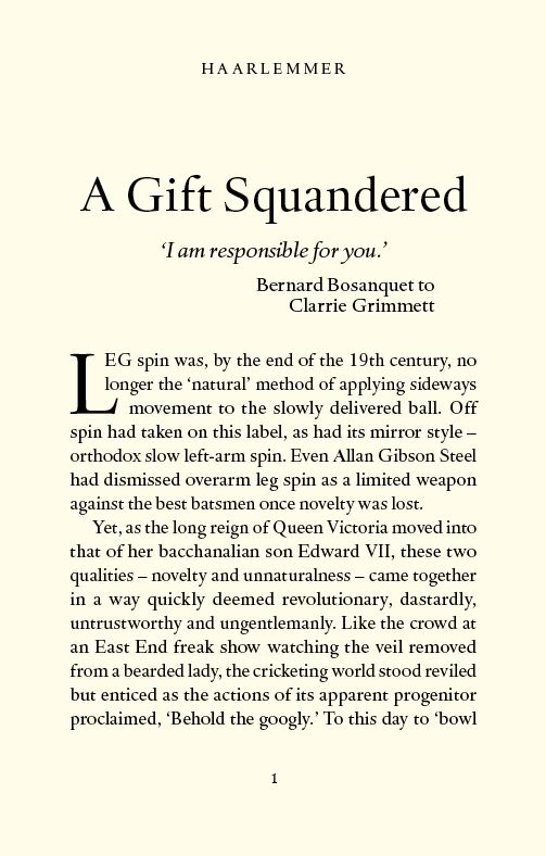
Haarlemmer
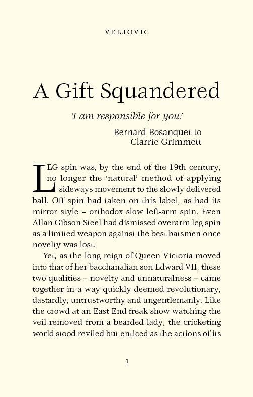
Veljovic
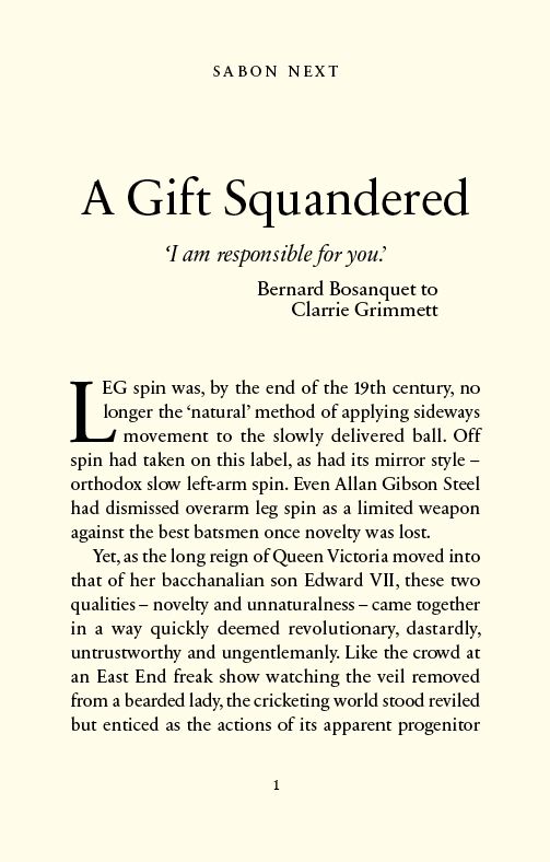
Sabon Next
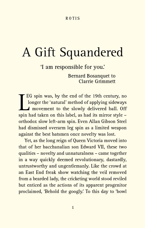
Rotis
Rockwell

Caluna

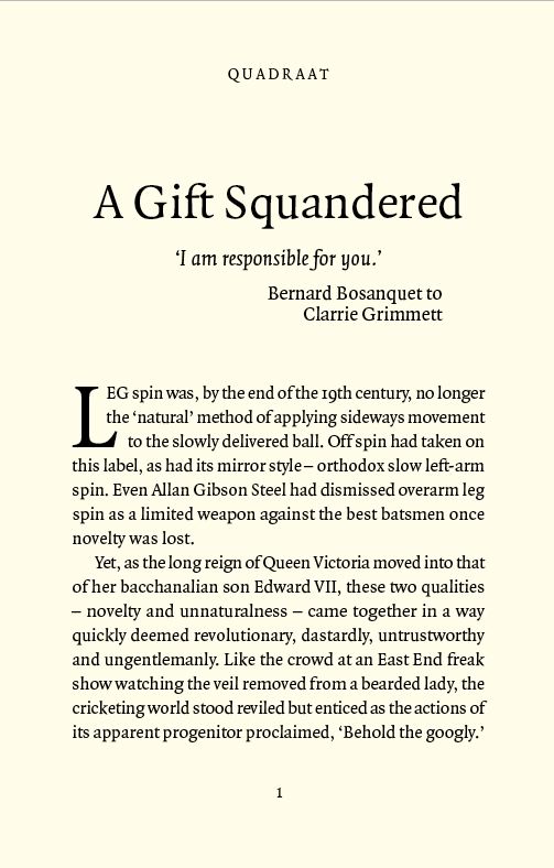
Quadraat
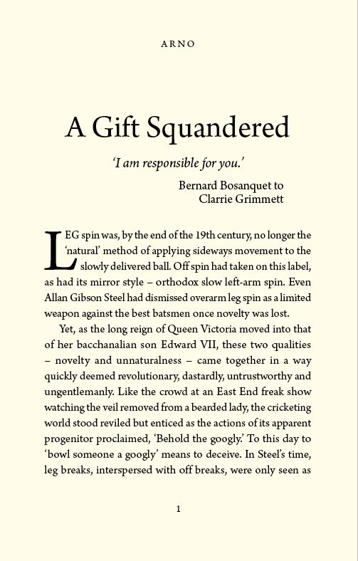
Arno
Pesaro
Facts about fonts
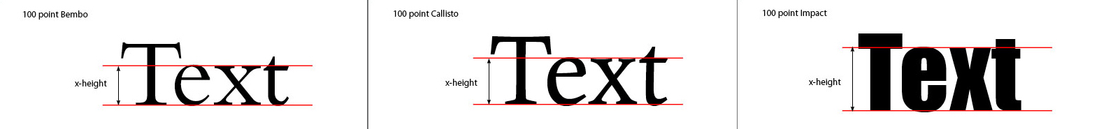
Don’t get confused by typeface point sizes. if you like the way another book looks, and find out that it is set in 11pt Bembo, you might think you can get pretty much the same effect on a page with 11pt type of a font you have. That rarely is the case.
Us typesetters are often more concerned with the typeface’s x-height in relation to the point size. The x-height is the height of the lowercase letters. Here’s a sample of 100pt Bembo which has a small x-height. A more modern roman face, Callisto, the x-height is almost 20% larger than Bembo’s. How about this sample of Impact. Remember that these three examples are all the same point size.
So when it comes to choosing type, make sure you know what it will look like on the book page. Factors like x-height have as much — and sometimes more — to do with how your page will look than just the size of the type might indicate.