Wanting to be known as a studio to be relied upon, that is friendly, extremely competitive and flexible, has flair, creativity, talent and experience that can boast over 30 years of working with books. I can give an assurance that every detail of a project will be carefully handled, deadlines adhered to, and the finished product as pleasing as possible.
      No job is ever too small.
      I will be delighted to discuss your typesetting requirements and work within tight budgets on an hourly, daily or project basis. My rates are £13/hour and scans can be as little as £2 each. Generally, a simple novel can be produced in around four hours. I can offer the complete book design service in the tradition of fine typography, prompt personal attention and familiar with producing highly illustrated and complex titles. I can prevent potentially costly delays and charges by taking the finished product to pdf, printer ready.
      Also, should you have a project you would love to see in print, poems, stories, memories or hobbies and want to self-publish, I offer these services to design and typeset your book, then outsource the digitally printed books, which can be as little as 20 copies, at a very competitive price. The quality can be exceptional. See my separate page about these services in the top menu. I am also a partner in a very small publishing company, North Bridge Publishing producing local-only books, teaming up again with Anton Rippon, the founder of Breedon Books, and we write and design all the books ourselves.

      And if you want to try and have a go yourself, check out my Helpful Information page, which may aid you in making your book look much nicer. There are tips on book sizes and binding, the best fonts to use for book text, proofreading marks and a few things to be wary of.

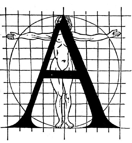
The painter and designer Geofroy Tory believed that the proportions of the alphabet should reflect the ideal human form. He wrote, ‘the cross-stroke covers the man’s organ of generation, to signify that Modersty and Chastity are required, before all else, in those who seek acquaintance with well-shaped letters.’ Tory was also the one we can blame for adding accents on letters in French.

AcrobatScreenSnapz001

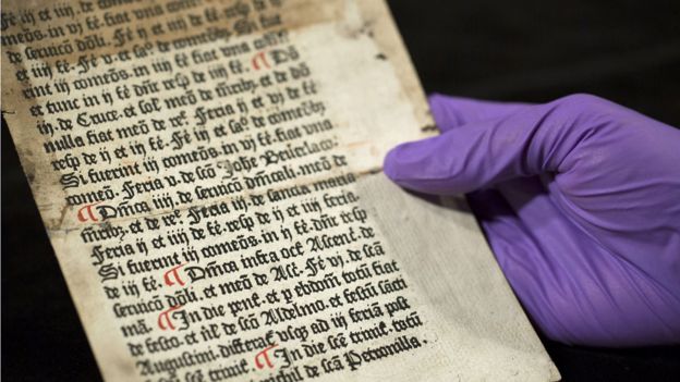
Caxton’s first ever printing when books were in a transition from manuscripts to printing. Red marks on the page, showing paragraph breaks, were added by hand after coming off a press.